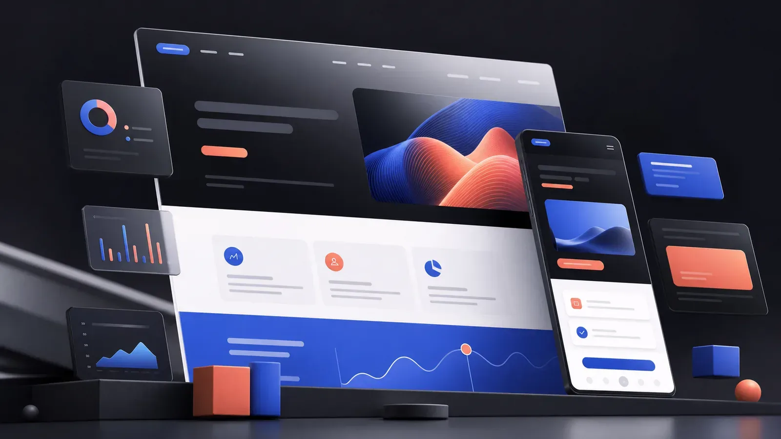
A website redesign doesn’t make sense when the team is simply tired of the old interface. It is needed when the site stops solving a business problem: visitors do not understand the offer, do not find important information, abandon the form, or do not trust the company.
Changing colors and animations by themselves rarely fixes the situation. An effective redesign begins with an analysis of the user journey, content, and technical constraints. The visual part consolidates the solution found, and does not replace it.
Signs that a site needs a redesign
The company’s proposal is difficult to understand
The user must quickly determine what the company does, who the product is intended for, and what to do next. If the first screen consists of an abstract slogan, and the meaning is revealed only after several scrolls, some of the audience will leave earlier.
The structure grew without a system
Over time, new services, promotions and sections appear on the site. Navigation becomes more difficult, the same pages begin to compete with each other, and important materials are hidden too deep. In this case, it is necessary to reconsider the architecture, and not just the appearance of the menu.
The mobile version works worse than the desktop version
The mobile interface cannot be considered a smaller copy of the big screen. On the phone, the context, available space, and order of actions change. Small text, cramped buttons, heavy images and long forms directly hinder the completion of the script.
The site is difficult to maintain
If a new block has to be assembled from scratch every time, and similar pages look different, the project lacks a design system. A redesign can unify components and speed up further development of the site.
Business has changed
The company could change its positioning, enter a different price segment, or add a new direction. The old site continues to tell the previous version of the story and sets incorrect expectations even before communicating with the manager.
What is website conversion
Conversion is the percentage of visitors who completed the desired action: sent a request, signed up for a consultation, placed an order, or proceeded to the next step. For information pages, an intermediate conversion could be viewing a case, tariff or contacts.
It is important to define the main action for each page type in advance. When one screen equally actively offers to call, subscribe, download a presentation and read the news, the user’s attention falls apart.
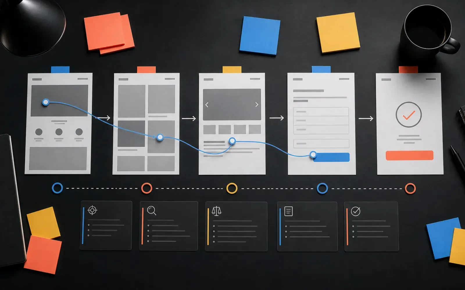
How the site redesign works
1. Setting a goal
First, the team determines what exactly needs to change. For example: improve the quality of applications, simplify the choice of service, explain a complex product, or adapt the site to a new identity.
The formulation “make it modern” is too vague. It does not help make decisions and evaluate the result.
2. Audit of the current website
The structure, texts, interface, mobile version and technical condition are analyzed. If analytics are available, it can be helpful to view popular routes, exit points, devices, and actions before submitting the form.
At the same time, feedback is collected from people who work with customer requests. They often know what questions the site does not cover and with what incorrect expectations applications arrive.
3. Designing the user journey
Scenarios are built for key audiences: from the first question to the target action. Then prototype pages are created without the decorative layer. At this stage it is easier to change the order of blocks, remove unnecessary things and clarify the content.
4. Visual concept and design system
After agreeing on the logic, a visual language is formed. The design should support hierarchy: highlight the main points, make it easier to read, and show the state of interactive elements.
Components - buttons, cards, forms and navigation - are assembled into a system. Thanks to this, new pages can be developed consistently, and development becomes more predictable.
5. Development and quality control
The layout is checked in a real browser, and not just in a graphics editor. Loading speed, keyboard navigation, contrast, form performance, and display on different screens are important.
After launch, you should make sure that the analytics records the selected actions. Without this, it is impossible to understand whether the changes have helped users and the business.
What changes can increase conversion
There is no universal button that is guaranteed to increase the number of applications. But a few principles regularly make the script clearer:
- a specific headline instead of a general advertising promise;
- noticeable main action on the page;
- responses to objections near the moment of decision-making;
- examples of work and evidence of competence;
- a short form that requests only the necessary data;
- clear button labels;
- good download speed and stable mobile version;
- absence of decorative effects that interfere with reading and control.
These changes must be assessed in the context of the product. For a complex service, a detailed case may be more important than a bright button, but for a familiar product, a quick path to registration is more critical.
When a complete redesign is not needed
Sometimes the problem is local. If users don’t notice one button or the form throws a technical error, a targeted fix is enough. A complete overhaul is warranted when the shortcomings are interconnected: the content, structure, visual language and technical basis are outdated.
Before you start, it’s helpful to separate must-have changes from “future” ideas. This helps to release a working version earlier and avoid turning the redesign into an endless project.
How to measure the result after launch
Compare metrics related to the original goal: form completion, conversions to tariffs, quality of requests, depth of viewing of key pages. Consider seasonality, advertising campaigns and traffic changes - a simple comparison of two weeks may give the wrong conclusion.
In addition to numbers, it is useful to observe real-life scenarios and collect customer questions. A redesign is not an end point, but a new foundation that can be improved through small, testable iterations.
Frequently asked questions
Should I keep the old design for the sake of recognition?
It is worth preserving working elements: color, typography, recognizable images or the familiar structure of important sections. The purpose of the redesign is to develop communication, not erase the company’s history.
Is it possible to increase conversion only with a new design?
Visual hierarchy affects usability, but the result also depends on the offer, copy, traffic, site speed and form performance. Therefore, it is better to consider redesign as a complex task.
Should I design first or write texts?
The structure and key messages should be developed along with the prototype. A design based on random text often has to be rebuilt after the actual content appears.